…. Update…Update… We have a winner: Congratulations to Naomi Gale, with her ‘target and arrow’ theme!
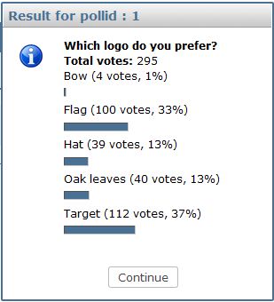
Thanks to the almost 300 who voted in the short timescale (we needed to take a decision at our LOC monthly call), and here’s the official result. We’ll be talking to Naomi about how the logo can form part of an overall website design over the coming week or so. We’re also all looking forward to presenting her prize at FOSS4G 2013.
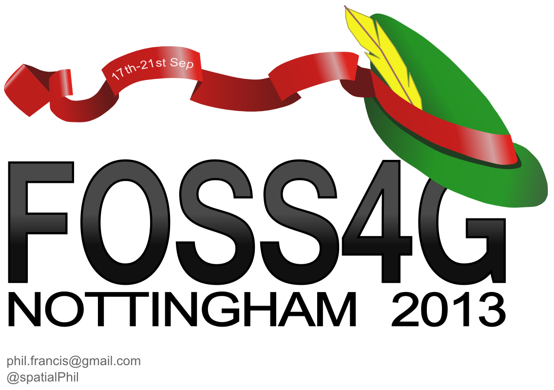
Here are the all the submitted designs, with thanks to all who submitted for a range of great entries!
.

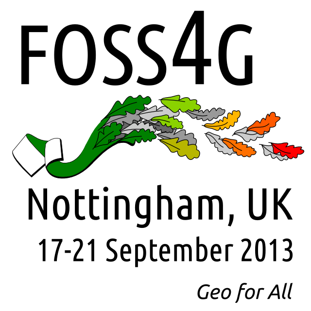





















I like the oak leaves but not crazy on the text font / layout, think that could use a bit of work. I’d drop the date and slogan for the main logo, could add those back in specific situations where needed.
Where’s the one with Forest logo? RT @StevenFeldman @foss4g: logo comp entries, vote for the one you like best http://t.co/0uivNVAB
FOSS4G 2013 Logo Competition http://t.co/Gcd9oqm4
RT @pmbatty: Vote for the @foss4g 2013 logo at http://t.co/LcyVsvYU
Don’t like any of them. > RT @sevenspatial: FOSS4G 2013 Logo Competition http://t.co/M897Oson
RT @foss4g: Let’s try again – have a look at our lovely logo comp entries, and vote for the one you like best http://t.co/nwwROylQ
Vote for the foss4g 2013 logo http://t.co/djQd3XuV
Wow! I think all the others are better than mine – personally I love the concept of the bow by ‘unknown’ as it combines nottingham and UK symbolism
I like the Robin Hood theme, which I’d push over the UK flag (as I think most people will know Robin Hood comes from the UK).
I suggest providing 2 shapes of the logo. A banner for the top of your webpage (same shape as the hat), and a portrait shape, for inclusion in other people’s web sites. There are some standard sizes for images that you should consider, but I can’t remember what they are.
I like the concept of the Bow best, but suggest dropping the UK flag from it (a simple logo is often better), and sharpening the colours – in particular using the usual red from prior ribbons.
The target is also good, and you might want to use the target for the banner version of the logo. You might want to consider switching the green for the ribbon red, and I’d be inclined to not alter the ribbon (into a shape of an arrow) but rather use it as an underline of the text.
The hat also deserves mention, which I like as well.
RT @StevenFeldman: Give em your vote RT @foss4g: Have a look at our lovely logo comp entries, and vote for the one you like best http://t.co/VxbVUS3C
FOSS4G 2013 Logo Competition http://t.co/yzHmOM3C Please vote for my Target Design!
FOSS4G 2013 Logo Competition — http://t.co/9ZHDVAAR MT @WasGehtInMexico via @sevenspatial
Vote Vote Vote! The lovely green target logo at the bottom! http://t.co/yzHmOM3C
Thanks for voting tweeps…my logo won! http://t.co/yzHmOM3C